|
|
|
|

|
When
you click on |
| Upper air plots are plan view plots of data that are measured twice daily, at 0000Z and 1200Z, at the stations shown here in the continental U.S., and at others across the world. A balloon is released with measuring instruments attached (radiosondes) and measures temperature, humidity and wind as it rises through the atmosphere. |
| To
load an upper air plot, choose This
upper air plot is from Sunday May 6, 2001 at 1200Z. The level
is 500 mb. It is similar to a METAR surface plot, but has a couple
differences. The parameters plotted are wind speed/direction indicated
by the wind barb, sky cover, temperature, dew point depression,
geopotential height and height tendency in tens of meters. These
are usually available for the standard levels of 200 mb, 250 mb,
300 mb, 500 mb, 700 mb and 850 mb. |
Radiosonde Observation Plots (RAOBS)
There
are other types of plots that are created using these radiosonde data.
Three that are available on FX-Net in the upper air menu are skew-T diagrams,
hodographs and a list of convective parameters; and are brought up by
clicking ![]() and then selecting a sub-menu under **RAOB**.
When the sub-menu opens you would then choose your location to plot. The
same applies to RAOB's that applied to Upper Air Plots, in that if you
choose one frame, you get the latest observation, and more frames chosen
give you that number of observations starting at the latest and going
backward in time. When you load a station's RAOB, you get a window with
a skew-T, a hodograph, a plot of 24-hour temperature change, and many
convective weather parameters that are calculated from the data. To save
space, I haven't shown the entire product as one piece, but you may take
a look at what FX-Net loads when you select a RAOB
station. For a better explanation of each, we
will examine them seperately.
and then selecting a sub-menu under **RAOB**.
When the sub-menu opens you would then choose your location to plot. The
same applies to RAOB's that applied to Upper Air Plots, in that if you
choose one frame, you get the latest observation, and more frames chosen
give you that number of observations starting at the latest and going
backward in time. When you load a station's RAOB, you get a window with
a skew-T, a hodograph, a plot of 24-hour temperature change, and many
convective weather parameters that are calculated from the data. To save
space, I haven't shown the entire product as one piece, but you may take
a look at what FX-Net loads when you select a RAOB
station. For a better explanation of each, we
will examine them seperately.
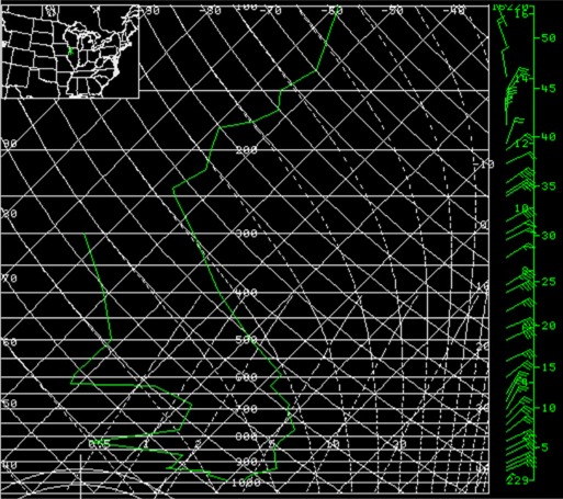
Skew-T diagramThis is just a part of what is loaded in the primary window when a RAOB site is selected. This is a skew-T diagram and is a trace of what the radiosonde recorded as it rose through the atmosphere. There is a temperature trace, a dewpoint trace and wind barbs plotted on the far right. For a short tutorial on skew-T diagrams see the Unisys Upper Air Sounding Details web page.The
skew-T usually loads ready to read and analyze, and zooming more
than once is usually not necessary.
|
 |
|
|
HodographThe image to the left is a hodograph that loads in the bottom left of the primary window when a RAOB station is selected and loaded. It appears just below the skew-T diagram. Notice that as it appears, it has very little available information. Once you zoom on it twice, all this information becomes available, as you can see by viewing this zoomed image.For
a short tutorial on reading hodographs, see this webpage from
the College
of DuPage.
|
Convective ParametersFinally, when you choose a RAOB station from the upper air menu and load it into the primary window, you get these convective parameters listed in the bottom right of the window, to the right of the hodograph. As you can see in the image to the right, the information is cropped out of the window by FX-Net when it initially loads. If you zoom on the data once, it will all appear fully in the FX-Net window, and be readable. All this data is calculated using the data supplied by the radiosonde, and plotted on the skew-T and hodograph. For definitions of what these parameters are, see this Glossary of Weather Terms from NWSFO in Norman, Oklahoma. |
 |
Wind Profiler Plots
| Wind profiler data comes from the profiler sites located at the points on this map. Wind profilers measure the atmoshpere with a longer wavelength than your standard radar, and measure the energy after reflection due to atmospheric density changes. Upon analyzing this type of radar data, wind speed and direction can be plotted from the ground up to about 11 km. |
|
Here
is an example of what you will see when
you select |
 |
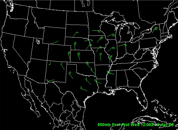
When you choose Plots under **PROFILER**, a cascading menu opens and you may choose a level of the atmosphere for plotting profiler data. This loads differently than the other profiler data, as the data is hourly and shown in plan view. Selecting one frame gets you the last hourly observations, and more than one gets you that many hours previous, ending with the latest. The plot on the left is the profiler network's observations at 1200Z on April 13, 2005. |
